%20(2).jpg)
What Colors Are Best for Engagement Photos?

Quick Answer
The best colors for engagement photos are neutral, soft, and natural tones that keep the attention on your faces and your connection.
Think: cream, beige, tan, soft blues, muted greens, warm earth tones, and dusty shades.
The goal isn’t to stand out.
It’s to look like you and let the moment be the focus.
Why Color Choice Matters More Than You Think

Colors don’t just look cute.
They change how your photos feel.
The wrong colors can:
-
distract from your faces
-
reflect weird color onto skin
-
make images feel dated fast
-
steal attention from emotion
The right colors:
-
keep the focus on your connection
-
photograph clean in different lighting
-
feel timeless years from now
And in Central Texas, this matters even more because we shoot in places with strong light and color reflection like open fields, limestone, brick, greenery, and bright skies.
Best Neutral Colors for Engagement Photos
If you want a safe option, go neutral.
These work in almost every setting:
-
Cream
-
Beige
-
Soft gray
-
Tan
-
Ivory
-
Warm white (not bright white)
-
Light brown / camel
Neutrals make your photos feel calm and clean, especially outdoors.
Pro tip: If you’re wearing white, choose warm off-white instead of bright white. Bright white can blow out in sunlight and pull attention.

Best Soft Colors That Photograph Well
Want color without overpowering the photo?
Go muted.
Great options:
-
Soft blue
-
Dusty rose
-
Sage green
-
Muted lavender
-
Warm rust
-
Soft mustard / golden tones
-
Deep olive
These shades add personality while still feeling natural.

Best Outfit Color Combos for Couples
You don’t have to match.
You just need to coordinate.
Here are combos that photograph really well:
-
Cream + tan + denim
-
Sage + beige + brown
-
Soft blue + ivory + khaki
-
Rust + cream + dark denim
-
Black + tan + texture (great for studio or downtown)
-
Olive + cream + warm neutrals
-
Dusty rose + beige + soft gray
Easy rule: Start with one neutral base, then add one soft color.

Colors to Be Careful With
Some colors can ruin the vibe fast.
Be careful with:
-
Neon or super bright colors (they reflect onto skin and overpower everything)
-
Loud reds or oranges (they can cast warm color onto faces and steal attention)
-
Busy patterns (they create visual noise and distract)
-
Tiny stripes or tiny checks (they can shimmer on camera)
-
Big logos or graphics (they date the photo immediately)
If you’re unsure, send me a quick photo of your outfits before your session and I’ll tell you what works.
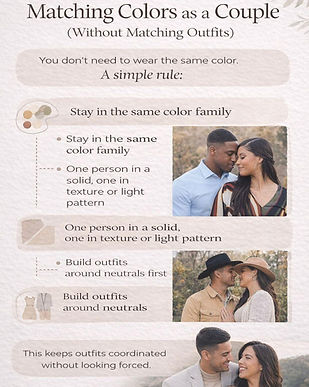
Matching Colors as a Couple (Without Matching Outfits)
You don’t need identical outfits.
Here’s how to coordinate without forcing it:
-
stay in the same color family
-
one person wears a solid
-
the other can wear texture like knit, denim, or linen, or a very subtle pattern
-
keep shoes simple and clean
-
avoid two bold statement pieces at the same time
Think balanced, not twins.
Let the Location Guide Your Colors
This is the part most people skip, and it’s the easiest way to nail your outfits.
Outdoor and nature (Belton Lake, fields, parks)
Best colors:
-
earth tones
-
creams and tans
-
sage and muted greens
-
soft blues
Downtown and urban (Temple, Austin, brick walls, murals)
Best colors:
-
clean neutrals
-
darker tones like black, deep brown, olive
-
simple contrast like cream + black
Studio and indoor
Best colors:
-
creams and soft neutrals
-
warm textures like knits and layers
-
muted tones like dusty rose, soft blue, olive
If you tell me the vibe (outdoor, downtown, or studio), I can recommend the best palette quickly.
Seasonal Color Tips (Central Texas Edition)
-
Spring: light neutrals, soft pastels, sage, soft blues
Summer: breathable fabrics and lighter tones like cream, tan, soft colors
Fall: warm earth tones, rust, olive, layers
Winter: creams, deeper tones, texture like knits and coats -
Season-appropriate colors always feel more natural and photograph better.

Quick Outfit Checklist (Before You Decide)
Before you lock it in, ask:
-
Does this color pull attention away from our faces?
-
Do our outfits look like they belong together visually?
-
Will these colors look good in sun and shade?
-
Are we wearing something we can move and breathe in?
If yes, you’re good.

FAQ: Colors for Engagement Photos
What colors look best for outdoor engagement photos?
Neutrals and earth tones photograph best outdoors: cream, tan, beige, olive, sage, soft blues, and rust.
Can we wear black for engagement photos?
Yes. Black looks great, especially for studio or downtown sessions. Add texture or a lighter neutral so it doesn’t feel flat.
Should couples match outfits?
No. Coordinating is better than matching. Stay in the same color family and balance solids with texture.
What colors should we avoid for engagement pictures?
Neon, super bright reds or oranges, busy patterns, tiny stripes or checks, and big logos.
What if we already picked outfits and aren’t sure?
Send me a photo of your outfits and I’ll give you a quick yes or no plus what to tweak.
-
What to wear for engagement photos
Book Your Engagement Session
If you want engagement photos that feel natural (not stiff), I’ve got you.
I serve Killeen, Temple, Belton, Harker Heights, Austin, and San Antonio, with studio or outdoor options.
Next step: message me with your date and your city, and I’ll send availability.
If you’re looking for engagement photographers in Austin, TX, start here.